National Theatre
A digital stage for London's finest.
A sleek, intuitive mobile app that consolidates booking, content discovery, and membership management into a single, seamless theatrical experience.
01. Overview
The Challenge
The National Theatre London wanted a mobile application to increase ticket sales and engagement, but the current digital experience was fragmented and not user-friendly. Users found it difficult to browse shows, book tickets, and access digital content.
The Solution: We focused on a dark, theatrical UI that captures the essence of the National Theatre while providing a frictionless booking experience.
Project Details
UX/UI Designer
Solo Project
6 Weeks
Figma, FigJam
02. Research
Discovering What Users Want
We conducted interviews with regular theater-goers to understand their pain points. The consensus was clear: the booking process needed to be streamlined, and the app needed to feel like an extension of the physical theater experience.
Sarah, 34
The Theater Enthusiast
Wants to easily discover new shows, book tickets quickly, and access exclusive behind-the-scenes content.
Frustrations:Clunky booking processes on mobile, missing out on limited-run shows due to poor notifications.
David, 28
The Casual Viewer
Looking for a fun night out, wants recommendations based on mood or genre.
Frustrations:Overwhelmed by too many options and unstructured information, hidden fees appearing during checkout.
03. Strategy
Competitive Analysis & Architecture
Market Landscape
We mapped out the core flows by analyzing direct competitors like TodayTix and ATG Tickets. The primary takeaway was the need for an interactive, visual seat selection process that works flawlessly on mobile screens without endless zooming and panning.
Information Architecture
A streamlined sitemap was created to consolidate content. The bottom navigation focuses on four core pillars: Discover, Search, Tickets (Wallet), and Profile (Membership).
04. Ideation
Wireframes
Focusing purely on functionality and layout before applying any visual design. The seat selection and checkout flow were prototyped multiple times to reduce friction.
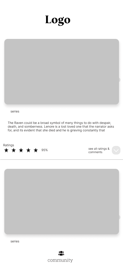
Series listings, ratings & community feed

Full-screen poster, reminder & bookmark actions
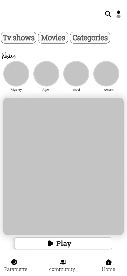
Category tabs, news carousel & Play CTA
05. Visual Direction
Design System
The visual identity mimics the physical experience of a theater: dark, immersive environments punctuated by vibrant, dramatic lighting.
- Typography: Inter. Chosen for maximum legibility on dark backgrounds and high data-density screens.
- Theme: True Dark Mode to reduce glare when using the app in low-light environments (like a theater lobby).
06. The Final Product
High-Fidelity Screens
HOME / DISCOVER

INTERACTIVE SEAT MAP
DIGITAL TICKET
Built for Every Screen
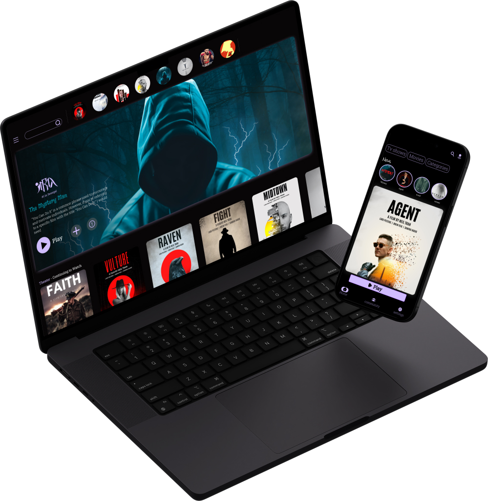
From the immersive desktop browsing experience to the sleek tablet layout — the design adapts seamlessly across all devices.
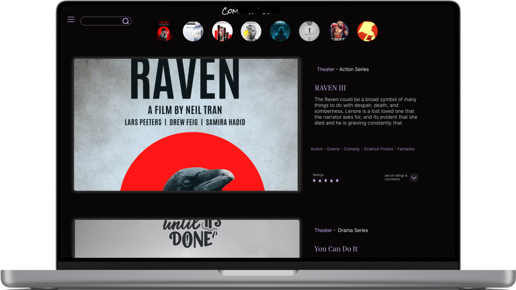
Full catalogue, film detail & ratings panel
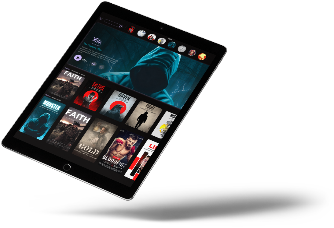
Dynamic grid layout with hero banner & categories
07. Retrospective
Learnings & Next Steps
Key Learnings
Designing a dark mode UI required careful attention to contrast and accessibility, ensuring text remained legible for all age groups. Simplifying the seat selection process was the most challenging but rewarding part of the project, as it directly removed the biggest user friction point.
Next Steps
- Implement a robust digital loyalty program.
- Add AR (Augmented Reality) features for "previewing the view from your seat" before purchasing.