Tay Fanla
A Senegalese Renting App
Aimed at travelers coming from abroad, bridging the gap between authentic local stays and secure, frictionless booking efficiency.

01. The Context
From the Beginning
Tayfanla wanted to build a localized booking experience that directly addresses the unique challenges of finding accommodation in Senegal. Working alongside the startup's CEO as the sole product designer, my objective was to architect a comprehensive digital platform from scratch.
Project Details
Sole Product Designer
UX / UI / Brand Identity
April 2023 - Present
Research to High-Fidelity
02. The Problem
A lack of trust when booking online.
"Foreigners struggle to find safe, authentic accommodation in Senegal without relying on expensive international platforms."
Informal Channels
The renting market in Senegal is heavily reliant on informal channels like Facebook groups or word of mouth, which creates a huge trust gap.
Payment Friction
Payments are a major issue since many locals don't use standard credit cards, making international platforms difficult for hosts to use efficiently.
Verification
A distinct lack of localized host and property verification leaves travelers feeling insecure about the quality and safety of their bookings.
03. Competitive Analysis
Market Gaps
We analyzed international giants like Airbnb and Booking.com, alongside local alternatives. While global platforms offer great UX, they charge high fees and don't support dominant local payment methods (like Wave and Orange Money). Local alternatives, on the other hand, severely lack a polished, secure digital experience.
Combine the premium, frictionless UX of international platforms with deep integration into the local Senegalese financial and cultural ecosystem.
04. Empathizing
User Persona

Fatou, 28 (Diaspora)
Location: Paris, France | Goal: Wants to visit home for the holidays but hates the hassle of finding a reliable apartment.
- • Transparency in pricing
- • Secure local/international payments
- • Verified, trustworthy hosts
- • Scam listings on social media
- • Hidden fees on arrival
- • Complex payment transfers
05. Architecture
Wireframes & Flow
Mapping out the core flows: Search, Filtering, Booking, and Payment. We focused entirely on minimizing cognitive load and making the verification status highly visible.
06. Visual Direction
Brand & Design System
The visual identity needed to reflect Senegalese warmth while maintaining modern tech reliability. We developed a scalable component library to ensure consistency across the application.
- Typography: Modern, clean sans-serif to convey trust.
- Components: Soft radius cards, accessible high-contrast buttons.
- Iconography: Minimalist, localized icons.
07. The Final Product
High-Fidelity UI
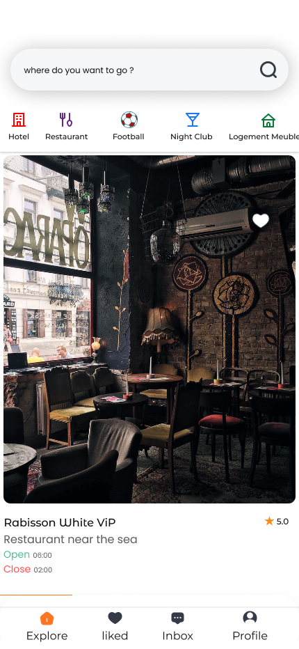
Category filters, search bar, and top listings
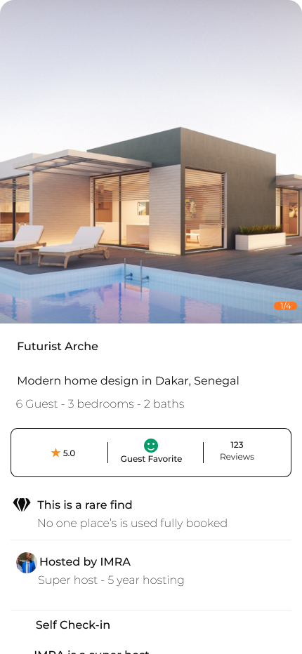
High-quality galleries, reviews & host verification
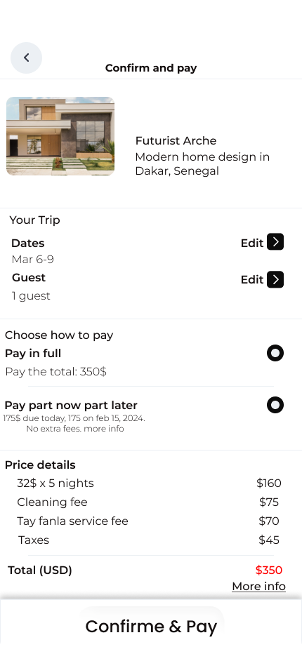
Clear pricing breakdown and flexible payment options
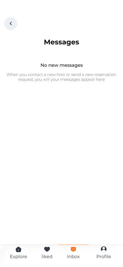
Direct communication hub with hosts and support
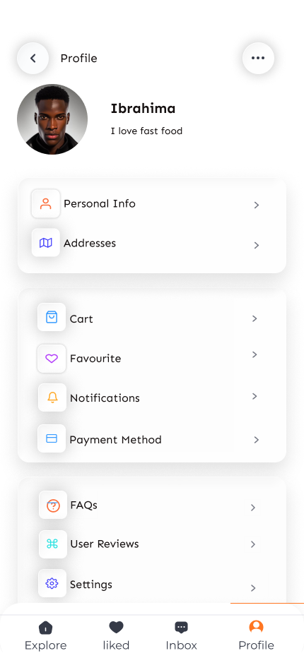
Account settings, history and personal preferences
08. Conclusion
Key Learnings
Designing for a specific cultural context requires breaking standard global UX rules. For instance, heavily emphasizing local payment methods (Mobile Money) over standard credit card inputs was vital. Ultimately, trust is the most important metric—if users don't feel secure, the best UI in the world won't convert them.